Upward VR
Brand Architecture • Strategic Growth Plan • Sensory Design • Website • Digital Presence • Photo + Video • Promo + Signage
Upward VR
Upward VR is a Virtual Reality Arcade located in Oklahoma City, Oklahoma. We had the incredible opportunity to consult, design, and collaborate on the Midwest's premier Virtual Reality Arcade. These were the main questions we tackled in order to create the brand of Upward VR:
How do you go about branding an entirely new concept with no data or research to rely on?
How do you introduce a foreign concept like VR to the masses?
How do you identify a target audience in an isolated, emerging market?
Most importantly, how do you make a VR Arcade’s brand connect with the masses?
WHAT WE DID
Brand Architecture • Strategic Growth Plan • Sensory Design • Website • Digital Presence • Photo & Video • Promo & Signage

The Challenge
Create a retail-oriented brand in an emerging market that is modern yet inviting, simple but descriptive, and memorable but not overbearing.
The Goal
Develop a brand & marketing strategy that is creative, innovative, and nimble, while being effective in defining and growing the customer base.
Branding
We had an absolute blast concepting & designing the visual identity of Upward VR. The icon clearly communicates an "immersive look," while the typography conveys a "futuristic" and modern theme.
We knew from the git-go that gradients would be key in defining Upward VR. We chose the colors of the 3 main gradients based off of natural elements.
The blue gradient was chosen from the natural gradient seen in the sky on a sunny day
The purple gradient was chosen based on an Oklahoma sunset in the heart of fall
The yellow gradient came from the rolling Oklahoma wheat fields as they meet the horizon at sunset
Bright yellow accents, combined with subtle & pale-toned gradients, help give the illusion of neon and an airy vibe. Using rigid, clearly-defined lines, combined with the use of negative space, we crafted the visual identity of Upward VR to be one that is completely unique & memorable.
Website
We designed the website to be incredibly smooth and user friendly. Utilizing the brand's gradients and design accents in every piece content, we designed & developed the website to feel like you were in the VR Arcade.
Because of the immersive nature of Upward VR's service offerings, we wanted to create a digital experience that felt like an extension of the VR Arcade itself.
Digital Presence
We crafted Upward VR's digital presence to connect seamlessly with all aspects of the brand. Utilizing gradients, sharp lines, and a clearly-defined visual structure, we created a multitude of social graphics, motion graphics, and campaigns to connect with the target audience. All promos directed the user back to the website, which created a "familiar" user experience based on the consistent design & established visual identity.
Social Media Promos
Social Media motion graphics
campaigns • click to view
Sensory Design
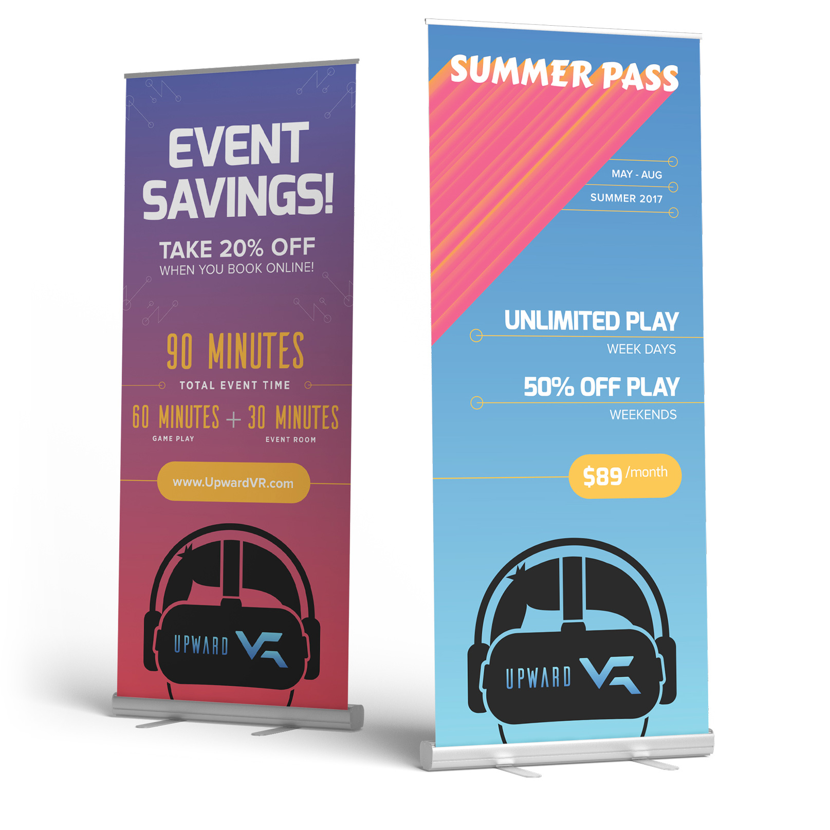
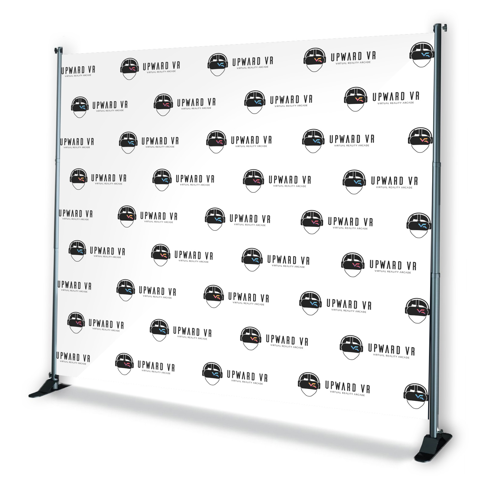
We quickly discovered that a majority of the VR Arcade's traffic came from people walking by in the mall. With this mindset, we designed promotional and educational signage that attracted people into the store to play. With strategic menus, information, and instructions, we provided answers to many questions a first-time VR user may have. This made for a more enjoyable experience for the user, and a more efficient staff for the owners.
